
Design Sprint: Five Days to Validate an AR Home Decor Experience
- Cody Roberts
- Jun 4, 2021
- 3 min read

Updated: 6 days ago
Type: 5-Day Design Sprint · Year: 2021 · Platform: iOS Mobile Sprint question: How might we help home decor shoppers make confident purchasing decisions without visiting a physical store? Five days. One validated prototype. One clear answer about what actually works.
Why this case study matters for how I work
Design sprints test something most portfolios don't show: how a designer works under constraint, ambiguity, and a hard deadline. This sprint ran the full GV methodology — Map, Sketch, Decide, Prototype, Test — in five days with real user validation at the end.
The outcome wasn't a shipped product. It was a validated direction and a clear set of IA decisions that any engineering team could build from.
Day 1 — Mapping the problem space
We opened with a full customer journey map of the home decor shopping experience, from inspiration browsing through purchase and return. The goal: find the single moment of highest friction worth solving.
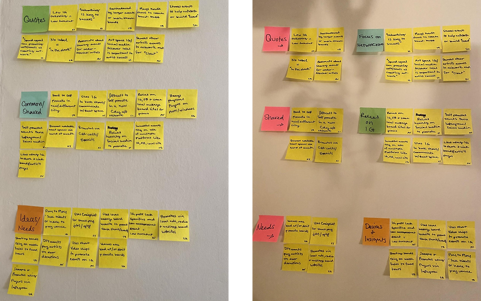
Affinity mapping — clustering research data to surface the core friction point across the purchase journey.
The affinity map synthesized inputs from three sources: existing research on return rates and abandonment, expert interviews (one retail buyer, one interior designer), and competitive audit of existing platforms.
Target moment identified: the "will this work in my room?" decision point. This is where confidence collapses — and where the opportunity was largest.
Competitive landscape — what already existed and why it wasn't enough

Competitive analysis — existing home decor and AR shopping experiences.

Competitive audit — visualization and discovery patterns across IKEA Place, Wayfair, Houzz.
IKEA Place and Wayfair had AR — but it was buried, required significant setup, and wasn't treated as the emotional centerpiece of the purchase decision. They built a tool. We needed to design a moment.
Days 2–3 — Sketching, deciding, and storyboarding

Concept sketches — three directions explored before converging on AR room placement.
Three concepts emerged from independent sketching: AR room placement (point camera, see furniture at scale), style match assistant (recommendation from owned pieces), and social proof contextual (user photos in similar homes). AR room placement won on dot voting — highest potential impact on the confidence gap.
Key IA decisions made during storyboarding:
Entry point: AR accessible directly from the product image — not buried in a settings menu
First-use tutorial: skippable but present — AR is unfamiliar UX for most users
Save state: users can save a placement and share it for joint decisions (this wasn't in any sketch — it emerged from asking "what happens after you place it?")
Fallback: room dimension estimator for non-AR devices
The save-and-share flow was the most-loved feature in testing. It came from one question during storyboarding: "What happens next?" That question is now part of how I evaluate every interaction flow.
Day 4 — Prototype

Figma prototype — AR placement flow simulated with static images.

Prototype screens — full journey from browse through placement, save, and checkout.
High-fidelity Figma prototype simulating the AR flow using static images — standard sprint practice when live AR isn't buildable in a day. The prototype covered the complete journey and was clickable enough to reveal real UX problems.
Day 5 — Testing and what we found
5 moderated usability sessions with homeowners who had shopped online for furniture in the past 12 months.
4/5 participants said AR placement would make them more likely to complete a purchase they were on the fence about
Save-and-share was the unexpected standout — users immediately connected it to joint home decisions with partners
Onboarding was too long — users wanted to get to the AR moment faster; content should be distributed contextually
Scale accuracy was the #1 trust factor — if users doubted size accuracy, confidence collapsed entirely
"If I could do this on the actual app, I would have bought that sofa last week." — Participant, Day 5 testing
What this sprint taught me about IA
The storyboarding phase is where the most important IA decisions happen in a sprint — not the sketching. Sketching generates options. Storyboarding forces sequencing: what comes before, what comes after, what the system needs to remember.
The save-and-share insight only emerged because we asked "what happens next?" at every screen transition. That's an IA habit, not a design instinct.


Comments