
Devlympics: Making Security Feel Like a Sport for 50K Developers
- Cody Roberts
- Aug 23, 2023
- 3 min read

Updated: 6 days ago
Role: Lead Product Designer · Company: Secure Code Warrior · Timeline: 2022–2023 Devlympics is Secure Code Warrior's annual global coding competition for 50K+ developers. I owned the full UX lifecycle: landing page, registration, competition interface, and results.
Impact
50,000+ developers on the SCW platform · Global reach across North America and APAC
WCAG 2.1 AA compliance maintained · Design system components contributed for platform-wide reuse

Secure Code Warrior — Devlympics event overview.
The design challenge: making security feel like a sport
Secure Code Warrior's core platform is compliance-driven training — structured, enterprise, mandatory. Devlympics had to feel like the opposite: high-energy, voluntary, competitive. The same visual design language wouldn't work for both.
The existing experience had grown organically. The result: inconsistent UI patterns, unclear competition state (Am I registered? When does this start? Where do I rank?), and a registration flow that created drop-off before anyone reached a challenge.
The audience was deeply technical and had zero tolerance for friction. If the UX failed them, they'd stop participating — and tell their colleagues.

Global participation map — Devlympics 2022, showing developer reach across regions.

Participation growth data — 2022 event performance benchmarks.
What research told me about developer expectations
I ran discovery sessions with stakeholders across North America and APAC, followed by interviews with 6 past Devlympics participants at varying skill levels.
Key findings:
Registration confusion: Participants frequently weren't sure they'd successfully registered until the event started
Competition state ambiguity: No "lobby" state existed between registration and go-live — users refreshed repeatedly
Leaderboard legibility: Rankings were accurate but impossible to scan under time pressure
Skill-level anxiety: Beginners dropped off when challenges felt inaccessible — no scaffolding or visible entry point
Mobile gaps: 30%+ accessed challenges on mobile; the experience degraded significantly below tablet width
How I structured the design work
I split the work by event phase rather than by screen type. Each phase had different user goals, different emotional states, and different design problems.
Phase 1 — Pre-Event: Registration and onboarding

Landing page wireframe — initial structure exploration.
Landing page wireframe — refined iteration with registration flow integrated.
Redesigned the registration flow with clear confirmation states, a persistent countdown UI, and an onboarding checklist for competition day prep. Added a dedicated "lobby" state between registration and event start — eliminating the anxious refresh loop.

Registration flow — redesigned with explicit confirmation states and lobby transition.
Phase 2 — During-Event: Competition interface

Tournament onboarding — first-time user experience for the live competition.
Rebuilt challenge navigation to clearly signal difficulty levels and allow participants to choose an appropriate entry point. Redesigned the leaderboard for scan-ability under time pressure: high contrast, bold rank indicators, real-time update states.
Phase 3 — Post-Event: Results and recognition
Created a results experience built around recognition — personal performance summaries, team rankings, and shareable achievement moments. The goal was social sharing and repeat participation, not just a completion screen.
Final designs

Devlympics landing page — final design at launch.

Landing page iteration — progressive refinement toward final.

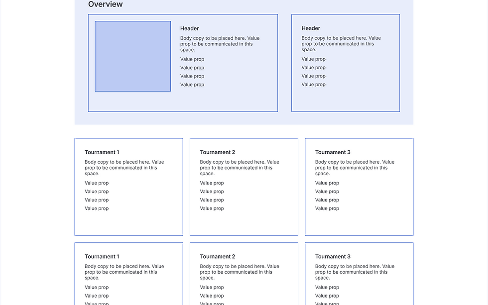
Tournaments view — competition interface with challenge navigation and leaderboard.

Tournaments — default state before competition opens.

Bonus Level — advanced challenge interface.

Tools and design system — component contributions for platform-wide reuse.
What I'd do differently
The fixed event date compressed the iteration cycle. I'd run moderated usability tests with actual developers on the challenge navigation flow before launch — this audience is technical enough that small friction compounds fast under competitive pressure.
I'd also push earlier for quantitative funnel data to measure drop-off at each registration step. The qualitative signal was clear; having the numbers would have made the business case for prioritization much stronger.


Comments