
Redesigning the Account Claim Experience: Usability Testing & Insights
- Cody Roberts
- Mar 17, 2025
- 5 min read

Integrating user feedback to optimize Inspira Financial’s account claim process.

Overview
Inspira Financial’s Account Claim process is critical for users transitioning their retirement accounts. However, without direct user feedback, the effectiveness of this flow was uncertain. To address this, we conducted usability testing to identify pain points and opportunities for enhancement.
Timeline: Q4 2024
Team: Product Design, Product Management, User Research
My Role: Senior Product Designer
Methods Used: Usability Testing, User Interviews, Data Analysis

Problem Space
The Account Claim process plays a pivotal role in helping users securely claim their retirement accounts. However, our research identified critical usability concerns that could lead to frustration, delays, and abandonment of the process.
Key User Pain Points:
Confusion: Unclear steps caused hesitation.
Trust Issues: Users questioned the legitimacy of Inspira’s communications.
Lack of Guidance: Users desired more educational resources to support their decisions.
Business Challenges:
User Drop-off: A lack of clarity may cause users to abandon the process.
Increased Support Queries: Users experiencing friction were reaching out for customer support.
Research & Discovery
Methodology
We conducted qualitative usability testing with moderated 1:1 sessions using Lookback.io.
[placeholder for video content example]
Approach:
Users were given a scenario where they had left their job and needed to claim their 401(k) funds from Inspira.
They navigated the claim process, while we observed pain points and gathered feedback.
Testing Details:
Length: 30-45minute interviews
Platforms: User Interviews, Lookback.io
Recruitment: 5 participants from diverse backgrounds
Participant Overview:
Name | Occupation | Age | Income |
Noah | Tax Accountant | 27 | $80-100K |
Stacey | Special Education Teacher | 39 | $80-100K |
Diane | Internal Medicine RA | 29 | $60-80K |
Christian | QA Analyst/Student | 27 | $40-60K |
Michael | Sales Representative | 62 | $40-60K |
Key Findings
1. Welcome Letter – Legitimacy & Visibility Issues
What worked well:
Instructions were clear and easy to follow.
The QR code for quick access was well received.
Pain points:
Some users questioned the legitimacy of the letter and wanted the former employer’s name included more than one location.
The unique code was hard to notice for some participants.
💡 Recommendation:
Highlight the unique code more prominently.
Include the former employer’s name for credibility.

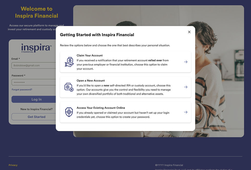
2. Login & ‘Get Started’ Screen – Generic & Unclear Terminology
What worked well:
Users easily identified the ‘Get Started’ button.
Pain points:
The design looked generic, making it feel untrustworthy.
Terms like ‘custody account’ and ‘claim your account’ were confusing.
💡 Recommendation:
Improve visual hierarchy to enhance credibility.
Replace confusing terminology with clearer wording.
3. Account Creation – Code Entry Issues
What worked well:
Most users immediately identified the code entry field.
The overall account creation flow was seen as straightforward.
Pain points:
One user completely missed the unique code in the letter.
QR code vs. manual entry: Some preferred scanning, while others manually entered it.
💡 Recommendation:
Improve on-screen prompts to reinforce the unique code’s purpose.
Ensure QR scanning auto-fills the code when possible.

4. Submission Steps – Clarity in Review & Submit Process
What worked well:
Most users successfully completed the Review & Submit steps.
Pain points:
Users struggled with selecting statement preferences and acknowledging required links for fee schedules and terms.
Instructions lacked clarity, making it difficult for users to understand required actions.
The design didn’t guide users effectively, leading to frustration and potential drop-offs.
💡 Recommendation:
Implement a guided flow UX to clearly direct users through statement preferences and required acknowledgments.
Improve copy to make required actions more explicit and reduce uncertainty with improved pattern consistency.

5. Status Screen – Delayed Verification & Missing Info
What worked well:
Users appreciated having submission confirmation.
Pain points:
Delayed Verification: Waiting 1–2 business days felt unnecessary.
Missing Account Details: Users wanted to see account number, balance, and next steps.
💡 Recommendation:
Provide instant verification feedback where possible.
Display key account details upfront to reduce uncertainty.

Recommendations & Next Steps
Based on our research findings, several UX/UI improvements were made to enhance clarity, streamline user actions, and introduce new opportunities for innovation across the Account Claim process.
Welcome Letter Improvements
Revised informational hierarchy for better readability.
Employer name and account balance now more prominent to increase trust.
Unique code visibility improved for easier entry.
Secondary study conducted to further refine messaging based on user feedback.

Get Started Screen Enhancements
Improved copy and UX to provide clearer options.
Research findings inspired a new AI-driven initiative to help users seamlessly navigate to the correct login page.

Account Creation Page Enhancements
Leveraged blank space for educational materials and improved visual indicators.
Added video explainer addressing how users’ retirement funds were transferred and the next steps.
Enhanced titles, subheadings, and copy to help orient users more effectively.
New Video Messaging:

Submission Steps UX/UI Innovations
Introduced a progressive accordion component to guide users step by step through required selections and acknowledgments.
Copy and content design improved to make actions clearer.

Submission Confirmation & Status Screen Enhancements
Minor status screen update: Added login prompt after submission to reflect that most users could access their accounts within five minutes.
New research initiative launched to improve email communications for clearer post-submission instructions.

Final Thoughts & Impact
The usability testing and research led to tangible improvements across multiple stages of the Account Claim process, making it more intuitive, trustworthy, and efficient for users.
Key outcomes of this initiative:
✔ Enhanced clarity in the Welcome Letter, Get Started screen, and Account Creation process.
✔ Reduced friction in Submission Steps through guided UX improvements.
✔ New AI-driven exploration to further optimize the login workflow.
✔ Refined post-submission experience based on real user timelines.
✔ Ongoing research efforts to improve email communications for better user guidance.
⭐️ These changes not only address user pain points but also unlock new opportunities for innovation in Inspira Financial’s onboarding experience.


Comments