
Artsee: IA-First Design for an Art Discovery App
- Cody Roberts
- Apr 3, 2021
- 4 min read

Updated: 6 days ago
Type: Self-Directed Project · Year: 2021 · Platform: iOS Mobile · Role: End-to-End UX & Visual Designer Art discovery is fragmented, intimidating, and disconnected from purchase. I designed a mobile experience to fix that — led entirely by IA and user research before a single pixel was placed.
The core IA question this project had to answer
How do you organize a multi-dimensional content space — artworks, artists, movements, mediums, price ranges, gallery events — into a mobile experience that feels like discovery, not search?
That's an information architecture problem before it's a design problem. This case study is structured to show that thinking.
I didn't open Figma until the site map and user flows were tested. Every screen that followed was an execution of those structural decisions.
Who this was designed for — and what they actually needed
Art-curious millennials and Gen Z: people who followed artists on Instagram, visited museums occasionally, and wanted to own original art but felt excluded by gallery culture and unsure about value and authenticity.
What they needed wasn't more art. It was a smarter guide.
"Show me art I'll love based on what I already love" — style matching, not genre labels
"Help me understand what I'm looking at without making me feel stupid"
"I want to follow artists and see their new work"
"Is this authentic? Is it priced fairly?"
Step 1 — Competitive analysis: where existing platforms failed

Competitive analysis: Meetup — event discovery patterns and community features.
Competitive analysis: Eventbrite — ticketing UX and browse experience.

Competitive analysis: Facebook Events — social discovery and follow mechanics.
The competitive audit revealed a consistent gap: no platform offered style-based discovery. All existing tools required users to already know what they wanted — artist name, movement, medium. For art-curious beginners, this was a dead end.
Step 2 — Site map: building the structure before the screens

Artsee site map — full IA showing content hierarchy, navigation model, and key user destinations.
The site map above captures the core structural decisions: a bottom-nav model with four primary destinations (Discover, Browse, Collection, Profile). Discover uses editorial curation as the entry point. Browse and Search serve users who know what they want.
The hardest IA decision: where does art education live? I chose to embed it contextually — accessible from any artwork view — rather than as a dedicated section. A dedicated education section would have felt like homework. Inline education at the point of curiosity feels like a friend explaining something.
Step 3 — User flows: new vs. returning users have different journeys

New user flow — from first launch through taste profiling, first discovery, and first collection action.

Return user flow — from launch through personalized feed, artist follow, and browse.
Mapping both flows revealed a structural problem: the new user flow required taste preference input before the discovery experience was useful — but front-loading a preference quiz created early friction. The solution was a passive preference model: users browse freely on first launch, and the system builds a taste fingerprint from their behavior. This required restructuring the onboarding section of the IA entirely.
Catching this IA conflict in the flow stage — not at hi-fi or in production — saved weeks of downstream rework. That's why flows come before wireframes.
Step 4 — Wireframes: testing structure before investing in polish

Lo-fi wireframes: onboarding — passive taste profiling and account setup.

Onboarding flow — annotated screen sequence.

Lo-fi wireframe: browse — art discovery grid with faceted filtering.

Lo-fi wireframe: contribute — artist-side upload and gallery management.

Lo-fi wireframe: profile — personal collection, following, and purchase history.

Lo-fi wireframe: filters — faceted art discovery by style, mood, medium, and price.
Wireframe testing with 4 participants uncovered a second IA issue: the filter taxonomy was too flat. Users expected to filter art by context (mood, setting, occasion) — not just by medium and movement. This led to a significant restructuring of the browse section's filter IA before any hi-fi work began.
Step 5 — Visual design system

Brand essentials — color palette, typography, and foundational design tokens.
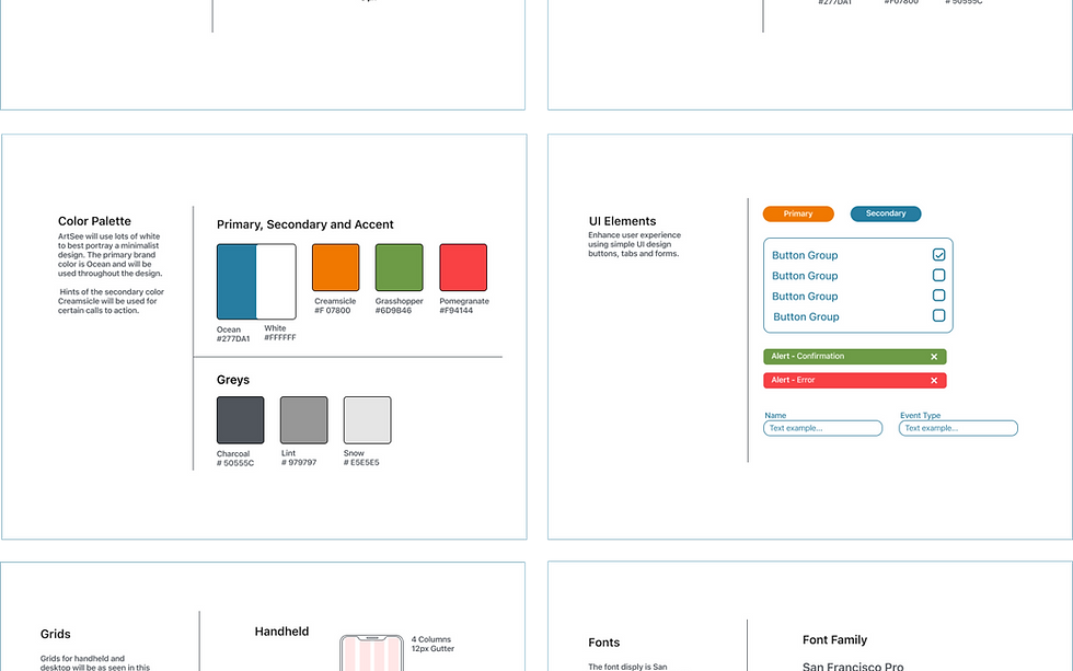
Style guide — component patterns, states, and visual language.
Gallery-quality, minimal, type-forward. The system had to feel authoritative enough to display art credibly, and warm enough not to replicate the intimidation of physical gallery culture.
Final UI — structure brought to life

Combined onboarding — passive taste profiling across first-run sessions.

Browse screens — art discovery with contextual filtering.

New event — gallery show discovery within the app.
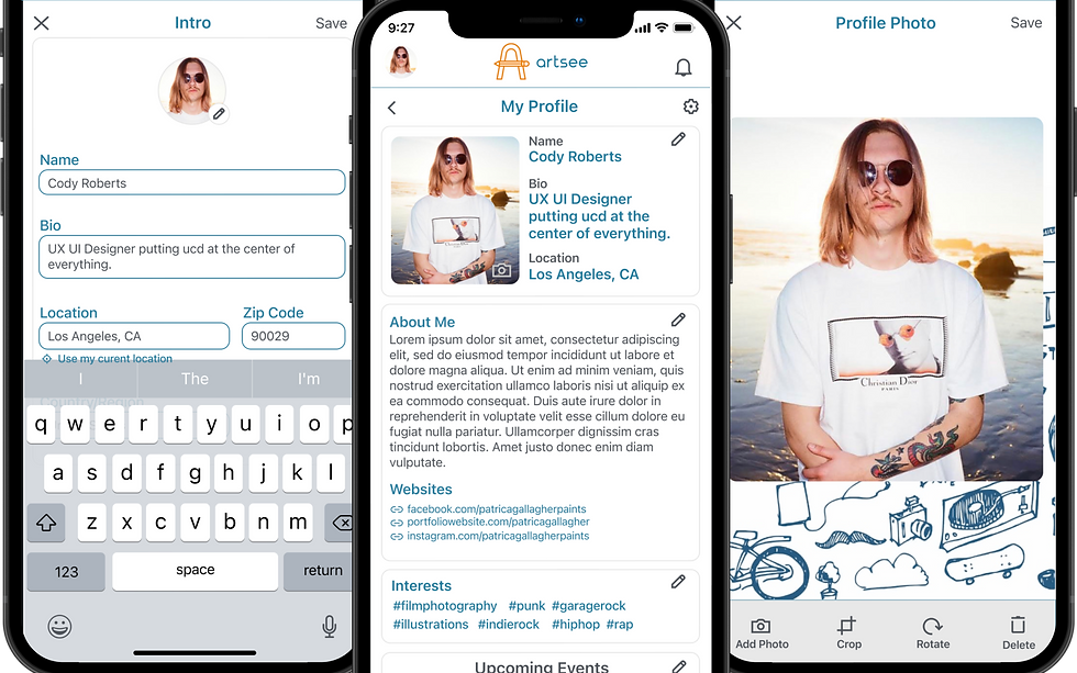
Profile — personal collection, following list, and social identity.

Browse event screens — local gallery events and openings.

Profile editing — collection bio and artist statement.
What this project taught me about IA
The filter taxonomy restructuring was the most valuable moment in this project. It happened at wireframe fidelity — not at hi-fi, not in a developer's lap. That's the correct place to catch a structural problem.
The principle that carried forward into every professional project: structure first, aesthetics second. The most beautiful interface built on the wrong IA is still a usability failure.


Comments