Devlympics
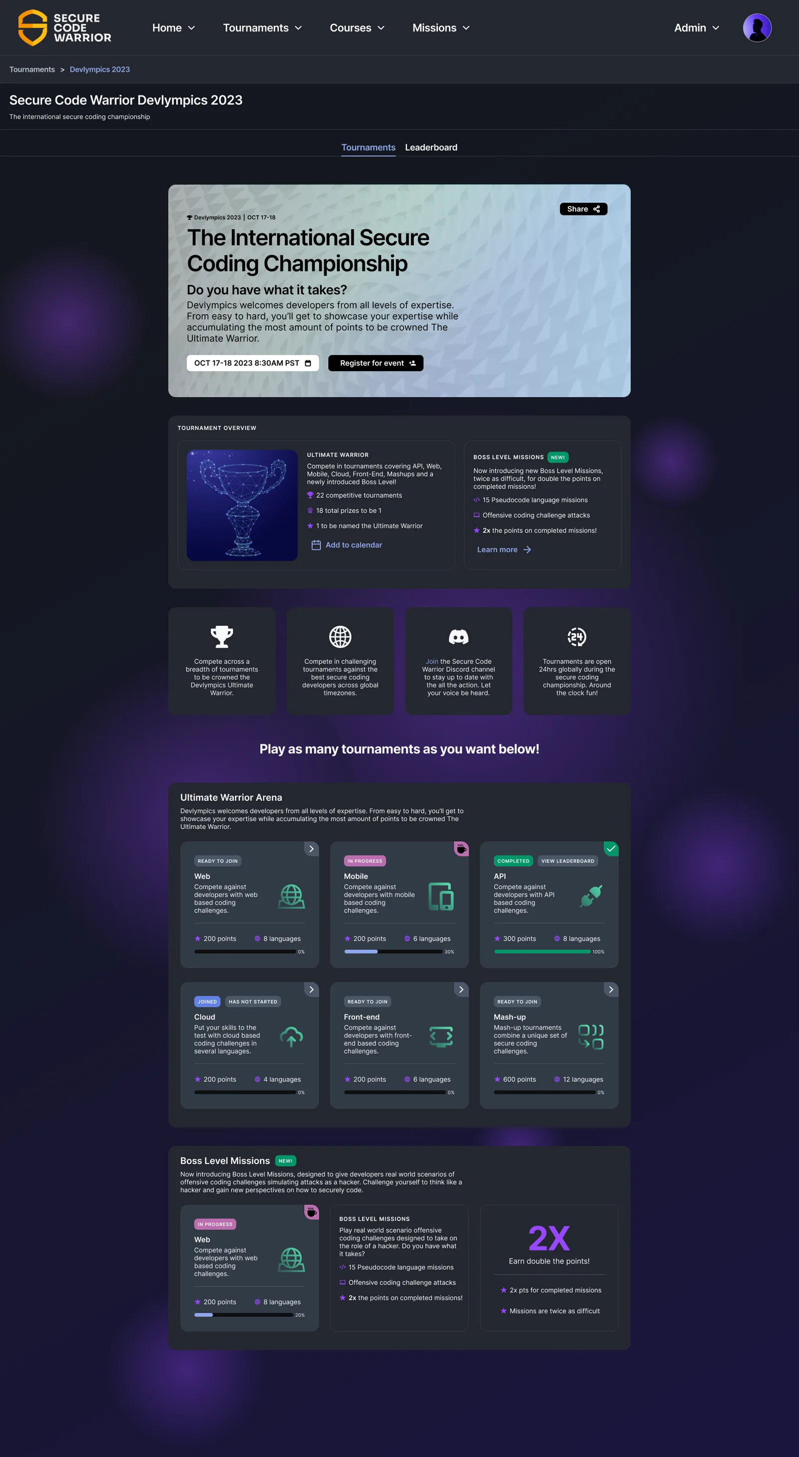
Making security feel like a sport
Devlympics is Secure Code Warrior’s annual global coding competition, reaching more than 50,000 developers across North America and APAC. I owned the full UX lifecycle: landing page, registration, the competition interface, and results.
The challenge was one of tone. The core SCW platform is compliance-driven training, and it’s meant to feel structured and enterprise. Devlympics needed to feel high-energy, voluntary, and competitive. The same design language couldn’t do both, and over time the experience had grown into a compromise that didn’t quite serve either.
That showed up as inconsistent UI patterns, an unclear sense of where you stood in the competition (Am I registered? When does this start? Where do I rank?), and a registration flow that lost people before they reached their first challenge. This is a technical audience with very little patience for friction, and if the experience let them down, they simply wouldn’t come back, and they’d tell their colleagues why.
What research told me about developers
I ran discovery sessions with stakeholders across North America and APAC, then interviewed six past participants at different skill levels. A few clear themes came out of it:
- Registration confusion. People often weren’t sure they’d successfully registered until the event actually started.
- No sense of “what now.” Nothing existed between registration and go-live, so people just refreshed the page, over and over.
- Hard-to-scan leaderboards. The rankings were accurate but tough to read under time pressure.
- Skill-level anxiety. Beginners dropped off when the challenges felt out of reach, with no scaffolding and no obvious place to start.
- Mobile gaps. More than 30% competed on mobile, where the experience fell apart below tablet width.
The fourth theme shaped the most design. Competition mechanics reliably motivate the top 10% and can quietly discourage everyone else, since a leaderboard mostly rewards the people already winning. A lot of my work became about helping someone who was never going to place still feel like they were making progress.
Structure before polish
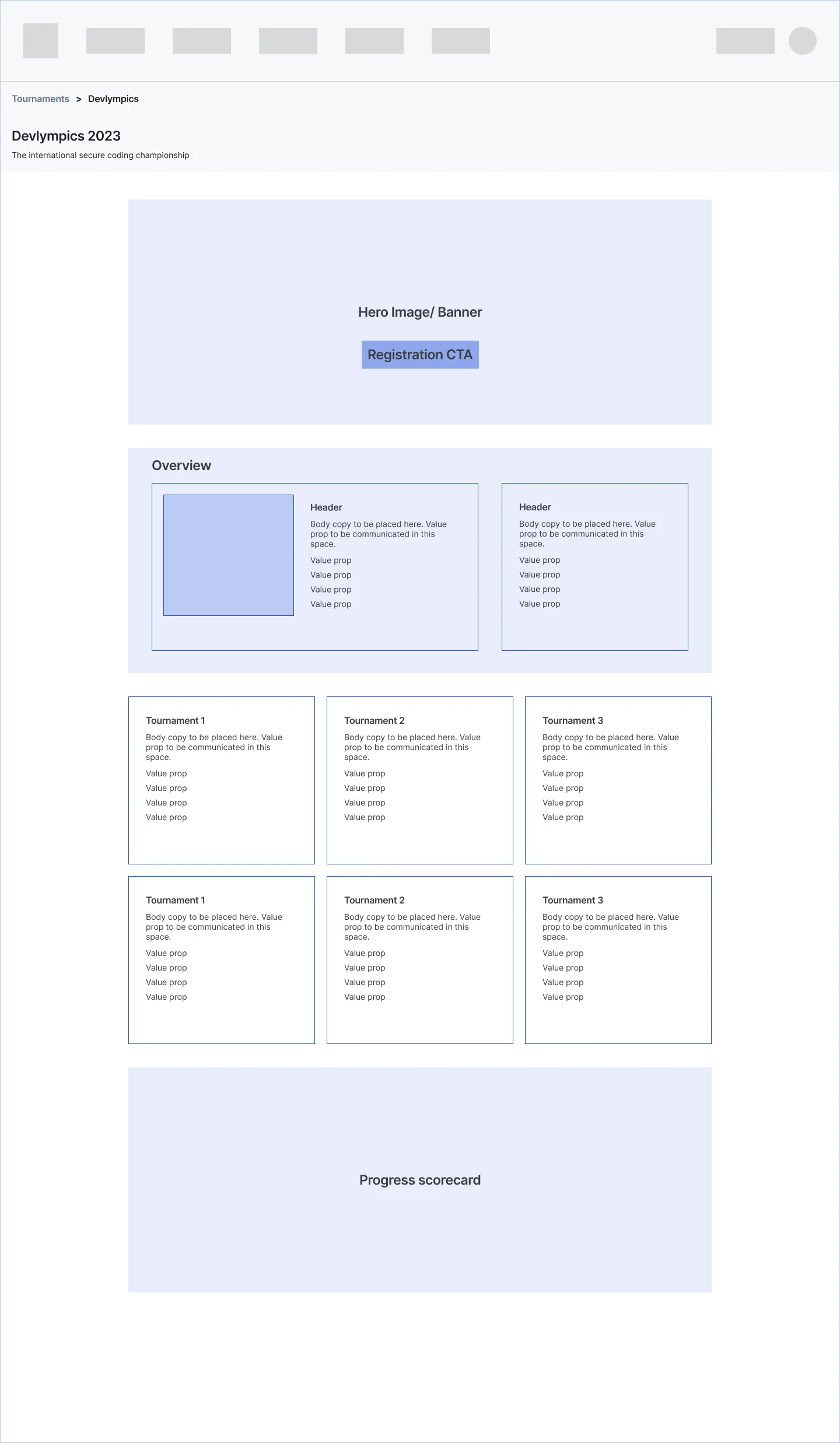
I settled the architecture first: the hero and registration call to action, an overview that answers what this is and why it’s worth your time, the tournament grid, and a progress scorecard. The visual design came after that.
Fixing the registration confusion
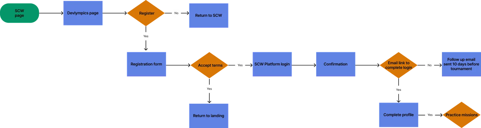
I mapped registration as a decision flow rather than a sequence of screens, and that’s what surfaced the real problem: there was no confirmation state. People finished the form and got nothing back to tell them it had worked. The redesign added a clear confirmation, a follow-up email ten days out, and an obvious path from confirmation into profile setup and practice missions, so the wait between “I registered” and “the event starts” finally had something in it.
The lobby, the thing that didn’t exist

My favorite addition to the whole project is one small box on this diagram: the “ready to join” state.
Before it, there was nothing between registering and the tournament going live, so people sat on a page that told them nothing and refreshed it. A real lobby, one that confirms you’re in, tells you what happens next, and lets you pick your language and difficulty before the clock starts, took that anxious refresh loop away completely. It cost very little to build, and it was the biggest single improvement to the pre-event experience.
Making state and progress easy to see
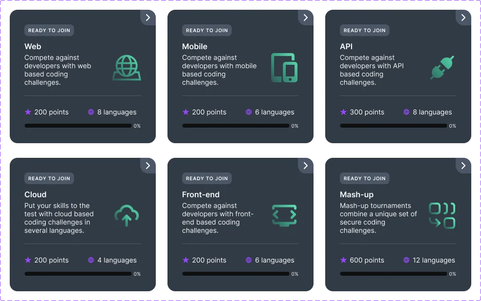
Every tournament card quietly answers three questions. Am I in this one? (READY TO JOIN, JOINED, IN PROGRESS, or COMPLETED.) How hard is it? (points and language count.) And how far have I gotten? (a progress bar that’s always visible.)
That progress bar is the answer to the skill-level anxiety we heard about. A developer who will never reach the leaderboard can still see themselves moving forward. Progress and rank are different motivations, and the original design only spoke to one of them. Putting difficulty and points right on each card also let people choose an entry point that fit them, instead of bouncing off whatever challenge happened to come first.
Components, not just screens
The patterns we built here didn’t stay inside Devlympics. The card components, state badges, and progress indicators all went back into the SCW design system for reuse across the platform. Given where my career went next, that turned out to be one of the most lasting things I did on the project.
Impact
- 50,000+ developers on the platform, across North America and APAC
- WCAG 2.1 AA maintained throughout
- Design system components contributed back for platform-wide reuse
What I’d do differently
The fixed event date really compressed the iteration cycle, and I let it. I’d carve out time to run moderated usability tests with actual developers on the challenge-navigation flow before launch, because with an audience this technical, small bits of friction add up fast under competitive pressure, and I shipped navigation I hadn’t tested with them.
I’d also push earlier for quantitative funnel data on where registration dropped off. The qualitative signal was clear, and having the numbers alongside it would have made the case for prioritization much easier to carry.